Posts mit dem Label illustration werden angezeigt. Alle Posts anzeigen

Montag, 11. Juli 2011

The Million-Dollar Pixie

Years before Cosmopolitan magazine became known as Cosmo and advocated that liberated, independent, strong, intelligent and powerful women keep a married man on the side to help pay the bills movie star Hayley Mills appeared on the cover, goofing around and reinforcing a young image.Cosmopolitan used to be a well-rounded periodical of not only light articles but some in-depth investigative stories as well. From the December 1962 cover Hayley Mills talks about how her family keeps her grounded, the ways the young women of Moscow are defying Cold War stereotypes of behavior and fashion and the growing number of adults who are taking care of grandchildren born by unwed mothers. I'd like to present the Hayley Mills family-centric article "The Million-Dollar Pixie" in its entirety but laying the magazine flat enough to scan the pages would cause them to separate from the binding. I'll leave that sort of damage to those who cut ads and art out of vintage magazines and sell them online. So instead of the fascinating Hayley article I'll present a few pages of interior artwork instead.

Like many other magazines of the time a lot of page space was filled with fiction and non-fiction stories. For my tastes it isn't so much the writing and authors that are of interest but the art and illustrations that accompanied the stories. Frequently the art is classic and highly skilled and is widely appreciated as a stylistic snapshot of the era. Of all the art in this issue of Cosmopolitan it is the two pages that accompany the "complete mystery novel" Snow Job by Malcolm Gair, illustrated by Mitchell Hooks that I like the most. I've got a thing for duo-tone (or nearly so) magazine illustrations.

He put out his hand to throw back the bedclothes, but Sally caught his arm in
her long tanned fingers and stopped him. "You're doped," she said.

When he got to the low point of the cliff, he looked up.
On top stood a figure with a large stone poised to throw.


Cosmopolitan changed in the way it did to stay relevant and alive by appealing to a young, trendy and orgasm-conscious female demographic. While not the New Yorker by any means it was not a bad magazine at all and was likely better than many it competed with on the news stands. The change in the magazine was a sign of what was happening in the publishing industry as a whole at the time. The fact is if Cosmopolitan didn't change to increase readers and ad revenue when it did it would probably have ceased publication decades ago and been all but forgotten. I'm glad that Hayley wasn't featured in the magazine during a time when the cover would feature "new" sex positions and ways to drive your man wild in bed.

Dienstag, 5. April 2011

Outstanding in his field

I'm really enjoying the new Avengers series primarily for the JRJR art though I'm not hating the story direction either.

In particular I appreciate this scene from Avengers #6 (Dec 2010) of Ultron standing at the crest of a pile of debris.

This panel conveys a real sense of horror and menace from the human-hating robot Ultron. In the past Ultron or any other villain, when shown as victorious, would usually be depicted standing in a vast control room or city that is an extension of itself. While visually appealing it also became somewhat of a cliche and usually the cause of the antagonist's defeat. A super-intelligent robot wouldn't really need to sit on a throne or connect to the internet though it looks good in CGI cartoons.

In the comic Ultron was placed in a scene where the robot's essential binary nature was revealed. Ultron is either ON or OFF, at ZERO or ONE. Having completed the directive to erase humanity from the planet Ultron stops in mid-step, inert until it is prompted to proceed again. Like an anti-life Roomba, Ultron apparently just walking the earth until the program was fulfilled, having extinguished all life. That's scary.

Montag, 7. Februar 2011

Art is Food

Great branding

My current dietary choices do not include chips and other snacks these days but I found this store branding of munchies clever and unique. The product is identified on the bag and draws attention by the cute doodles centered around a chip or cheese puff. As marketing goes it is a pretty nice effort and goes beyond what one usually sees for labeling for a generic store product.

There are several illustrations but my favorite is the potato chip mouse being threatened by a venomous snake.

Samstag, 25. Dezember 2010

Merry Christmas and Happy Holidays for 2010!

Child Life #1 (1928)

Vintage art and a poem from Child Life #1 (1928). Words by Marjorie Barrows, art by Margaret Whitman.

Donnerstag, 18. November 2010

Sonntag, 24. Oktober 2010

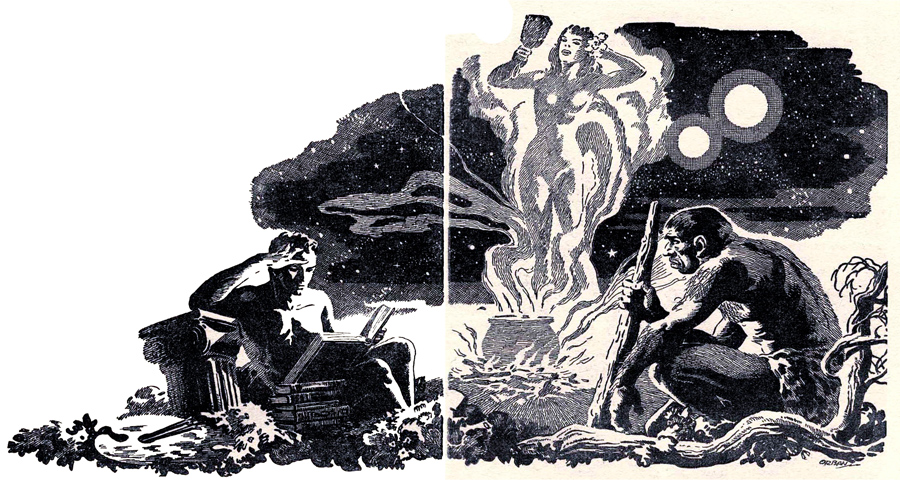
The Two Shadows

From The Two Shadows, published in Startling Stories (March 1951). Story by William F. Temple with art by Orban.

Mittwoch, 13. Oktober 2010

Sammy, The Sociable Seal

Sammy, the Sociable Seal

From Reader's Digest, Animals You Will Never Forget, 1969. Artist unknown.

Freitag, 10. September 2010

Montag, 30. August 2010

Dying is easy, it's math that's hard

This just might be my first tattoo. Unless I do that thing with my fingers like Robert Mitchum.

DEATH x 2 = 0!

Story title from Nightmare #13 (August 1954). Art by George Tuska.

Dienstag, 24. August 2010

5 Fingers

Been watching a lot of noir lately and came across this poster for the movie 5 Fingers (1952).

Poster art seems to be a lost skill these days as research shows that big giant, recognizable heads heads on a display is what sells tickets and DVDs. Compare the original 5 Fingers poster with the DVD packaging for the 2006 remake Five Fingers, loosely-based upon the original.

But it isn't the evolution of movie art that moves me today. Fashion is. The original 5 Fingers poster inspired me to make a proof-of-concept glove inspired by the poster.

I could totally see some hot, dangerous, billiards-playing woman wearing a glove with LUST, GREED, PASSION, DESIRE and SIN embroidered on the fingers in heavy, silver metallic thread. Any wolf that got fresh with her would end up having those words bruise-embossed into his forehead.

Hmm. This idea will probably be ripped off and for sale in a Hot Topic or an Etsy store within the month.

Sonntag, 22. August 2010

Handyman's Book

Binder and loose-leaf pages found complete at a dollar book sale. Loaded with useful repair tips, diagrams and detailed how-to instructions. Still basically useful except for the parts about vacuum tubes and cloth-insulated wiring.

BH & G Handyman's book cover (1957-1966)

Nice retro cover illustration featuring the swooning, enamored housewife proud of, and presumably wanting to copulate with, her man George.

BH & G Handyman's book interior (1957-1966)

I don't know about this living room. An aquamarine color scheme with the chair camouflaged to disappear into the carpeting. I never knew the Camelot era was so tacky.

Better Homes and Gardens Handyman's Book (1957 cover binder, updated to 1966 interior loose-leaf pages).

Freitag, 13. August 2010

It's canon, fanboy

Canon City

From now on, I'm doing EVERYTHING with the NAKED FURY OF FACT!

"How was lunch?"
"Good, good. Had a salad."
"You always have salad."
"Yeah, but today I ate it with the NAKED FURY OF FACT!"

Canon City (1948).

Montag, 9. August 2010

Dienstag, 3. August 2010

Marcos Mist

Everyone familiar with comic books knows of the "Kirby Krackle", that pulsating, burning aura popularized by artist Jack Kirby that epitomizes the idea of unleashed and unlimited power. But who is familiar with the equally ubiquitous and unsung "Marcos Mist"?

Where the Kirby Krackle displays energetic violence there is another artistic device that conveys a more earthbound element and that is the Marcos Mist.

Celebrated comic book veteran artist Pablo Marcos renders fog and mists as more than mere moody scenery. In his horror and fantasy work mists are something animate, baleful and more often than not depicted as an extension of a character. Marcos Mist exists on a personal and cruel level. Where the Kirby Krackle lays waste to planets the Marcos Mist is a cold, thick and miasmic swirl of fog and shadow that envelopes and snares a victim.

Marcos Mists are organic and have more in common visually with blood-spatters than airborne droplets of water. That the Marcos Mist resembles crime scene evidence more than an atmospheric condition is a sign of careful wit and talent by Pablo Marcos and is more than a stylistic artifact of a particular artist.

So when reading your old Marvel horror books keep an eye out for the Marcos Mist. It just may have crept in and surrounded you without you even noticing.

Montag, 2. August 2010

Sign of the Beetle

First up in this entry of the Cool Golden Age Page of the Day is this great full-page fight scene featuring the Blue Beetle from Mystery Men Comics #12 (July 1940).

I'd be hard-pressed to find a scene as cool as this one in another comic book. Not bad for what was considered disposable entertainment. A nice testament to the talent and professionalism of the artist, who is credited as Charles Nicholas.

The second cool page is from the same story. After beating down the crime gang the Blue Beetle painstakingly arranges the bodies in the shape of his totem as his signature. Not really necessary since back in the Golden Age before cross-overs each hero existed alone in their universe. Villains there were plenty of but heroes were often alone except for the occasional un-powered kid sidekick. There was probably only one person on earth who could possibly have beaten senseless 50 armed hoodlums but Dan Garret signed his work of art anyways.

Donnerstag, 29. Juli 2010

New Universities Dictionary Illustrated (1922)

Pages from New Universities Dictionary Illustrated (1922). The book is all but disintegrated from age and weathering but I managed to save the artwork. No artist information can be found in the book though there seems to be a signature on the Plumage page. I can't determine if that is the artist name or the previous owner of the book.

Samstag, 24. Juli 2010

Inside

Take a second look. Interesting, that the frenzied 'motion lines' are the track titles.

From Inside Sauter-Finegan. Album art by Jim Flora (1953).

Mittwoch, 21. Juli 2010

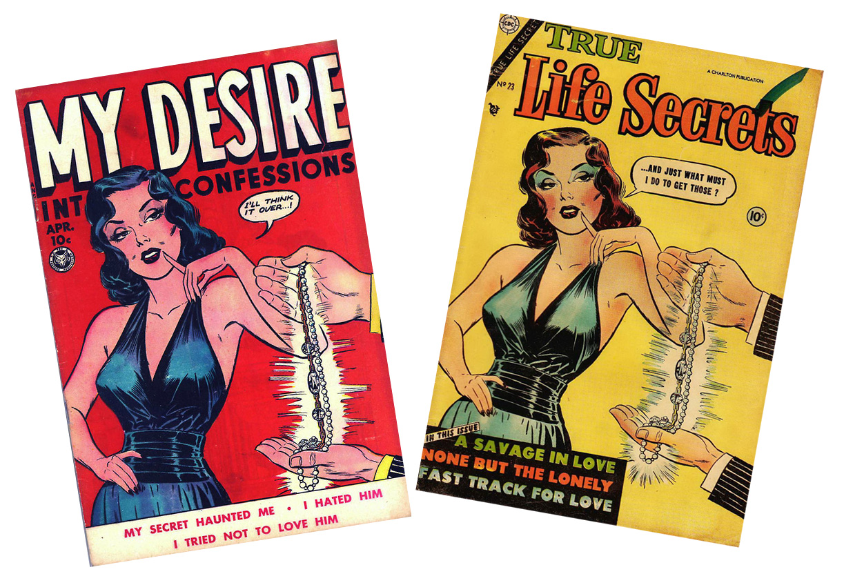
My True Life Intimate Secret Desire Confessions

On the first cover by the time we see our heroine she was already salaciously propositioned and is mulling over her choice. On the second she is wryly, perhaps with amusement, dismissing a wolf. Both covers are iconically lurid but what a difference four years makes in the approach.

From My Desire Intimate Confessions #4 (Fox, April 1950) & True Life Secrets #23 (Nov-Dec 1954).

Donnerstag, 15. Juli 2010

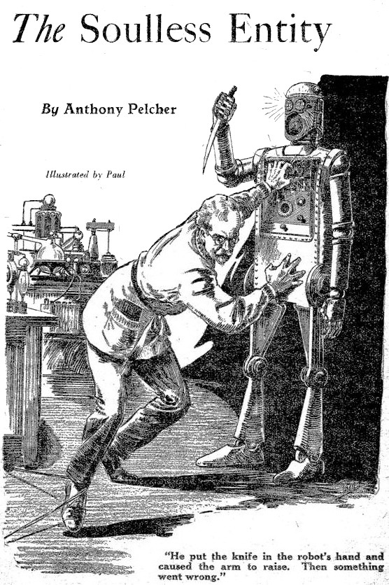
Then something went wrong

From Thrilling Wonder Stories #1 (January 1931). Art by Frank R. Paul.